
You may be familiar with our weekend Box Art Brawl series where we pit regional versions of the same game against each other in a gladiatorial poll to find out which has the best cover art. That’s all well and good, but there are a great many terrible examples that will never experience the glory of combat in our crucible of public opinion. So, we thought we’d take a mid-week look at a collection of lowly souls that demonstrate the very worst of video game box art.
You can vote at the bottom of the page, but there’s no honour for any these contenders. You should also be aware that you’ll find no ‘so bad they’re good’ candidates here, either – we can all joke about how terrible the western rendering of Mega Man is on the original box art, but it’s a stone-cold masterpiece compared to the no-hopers we’ve got lined up for you today.
Regardless of their relative failures, few of the contestants we’ve looked at in Box Art Brawl are irredeemably awful (except, perhaps, Street Gangs) and even if their composition or colour palette is lacking by comparison, there’s generally evidence of talent, effort or at the very least some thought that’s gone into them, however misguided.
The following collection is largely bereft of redeeming qualities, though. We choose to believe that the people responsible for these ten covers simply didn’t care about the game or the box or anything at all. We choose to believe this because the idea that somebody sat back after a hard day’s work and said to themselves “yep, nailed that one” is too depressing to bear.
So, allow us to resurrect these wretches for your education and entertainment before returning them to the vile dust from whence they sprung, quite rightfully unwept, unhonoured and unsung.
Real Madrid: The Game (Wii, 2009)
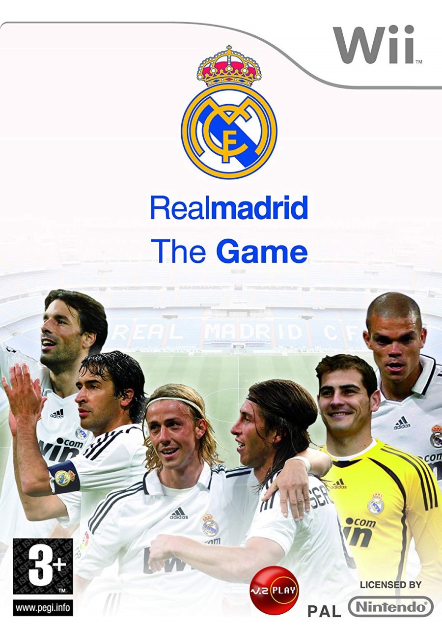
We begin with this official cover for the officially-licensed Real Madrid: The Game. We get a handful of the white-kitted Spanish team in a crudely photoshopped horseshoe in front of an image of the Bernabéu Stadium which is fading to white – presumably to make the players stand out? – as the white sky rubs against the standard white strip with the Wii logo.
Plenty of white, then. It looks like something you might print for the cover of a school project if your dad didn’t want you to waste the colour ink. As we’ll see, the Wii era was plagued with an abundance of abominations, but rarely was so little effort employed.
Jovial Race (NES, 1991)

At a time when Sonic the Hedgehog represented the speed and overt ‘cool’ that was in vogue, it’s hard to see this getting off the drawing board, but here it is. Jovial Race (we’ll forgive you if you didn’t catch the title from the box) is a port of arcade game Rally-X. Perhaps communicating the sedate nature of this top-down maze-chase game was the goal here; if so, mission accomplished. Welcome to Driving Miss Daisy: The Video Game. Pedal to the metal, gearheads.
Russell Grant’s Astrology (Nintendo DS, 2009)
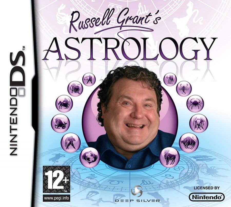
Readers from outside the UK (or anybody under the age of 30) may be unfamiliar with Russell Grant, but he has been arguably the country’s foremost astrologist since the 1980s and has appeared on breakfast shows, in tabloid newspapers and, more recently, on a variety of reality shows including Strictly Come Dancing and Celebrity Masterchef. If you’re after a minor celebrity astrologer and Mystic Meg’s not picking up the phone, Russell’s your guy.
In all honesty, there’s evidence of compositional consideration here, the font and background betray some thought and UK residents may even experience a shot of nostalgia at the sight of Russell Grant on a video game box. It’s still rubbish, though. Nothing against Russell – we’re quite certain we wouldn’t make great cover material either – but this headshot looks like a cropped screenshot from the Strictly intro. He’s inviting you round for a nice cup of tea and a sticky bun, not to ponder the mysteries of the Zodiac. Perhaps that’s what they were going for.
The cover makes us wistful for British household names from the ‘80s (the remaining few who haven’t been exposed as prolific criminals, that is) who never got their own DS game. Yes, we got Golden Balls and several Deal Or No Deals, but Beadle’s About had incredible potential as an open world sandbox, no?
If you’re selling your game in the strength of a portly British celebrity, the next cover is another example of how not to do it…
Cheggers Party Quiz (Wii, 2007)

Ah, the perils of CG. Keith Chegwin or ‘Cheggers’ was an affable television presenter known for his exuberant style and happy-go-lucky personality and this cover plays on his recognisable visage. If you have no clue who Cheggers is, you may find it alarming; he should probably get that thumb seen to as well. Too much white is a running theme with the worst box art, but the grammar of the title here also winds us up. The lack of definitive article suggests an apostrophe is needed after Cheggers’ name (see?) to show the Party Quiz is his. It’s not though – it’s the Cheggers Party Quiz, just without the ‘ the’.
We can only apologise to non-UK readers for inflicting these on you, but it’s important to have plenty of material to throw the next time some wag says the North American Mega Man box art is ‘the worst thing ever’. Oh no. Oh no, my friend – tell me, are you familiar with Cheggers?
Karnaaj Rally (GBA, 2003)

Let’s not dwell on the awful title. Let’s not dwell on the checker flag background the two checker flags poking out of the ‘R’. Let’s not dwell on the minuscule ‘RALLY’ or the blurry mess of the car or Vinnie Jones’ little brother who looks like he got halfway though his Halloween make up and then thought “that’ll do – now to the pub”. Let’s not dwell on how he appears to be sneezing up the Official Nintendo Seal of Quality…
Damn it. We dwelled on everything. Let’s move on.
Petz Monkey Madness (Wii, 2009)
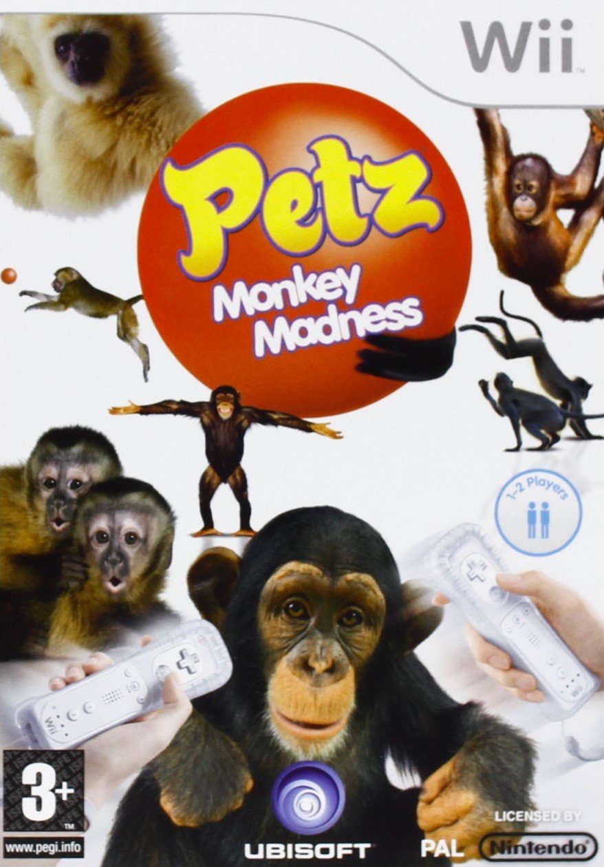
Try as we might, it’s tough to avoid the Wii for too long (be sure to check out Chris Scullion’s round up of Wii covers for a host of hammy horrors). 2009 seems to be a convergence point in the space-time continuum for particularly terrible box art.
Looking for all the world like your gran typed ‘monkey’ into Google Image Search, Petz: Monkey Madness (or Petz: Crazy Monkeyz in North America) shows a bunch of simians and a couple of Wiimotes. It comes from the same lineage as the Dogz and Catz series, but there’s a swathe of irritatingly pluralised animals to choose from, from Horsez to Hamsterz and beyond. We’d make a joke about Ballz, but that happens to be the title of one of the developers’ first 16-bit games.
The Petz games sit in Ubisoft’s stable alongside the Imagine series (the Babiez games being particular stinkers when it comes to box art) in a category aimed primarily at young girls. Apparently that demographic really responds to poorly photoshopped images and blank white spaces. Kids deserve better. Poor show.
Rival Turf! (Super NES, 1992)
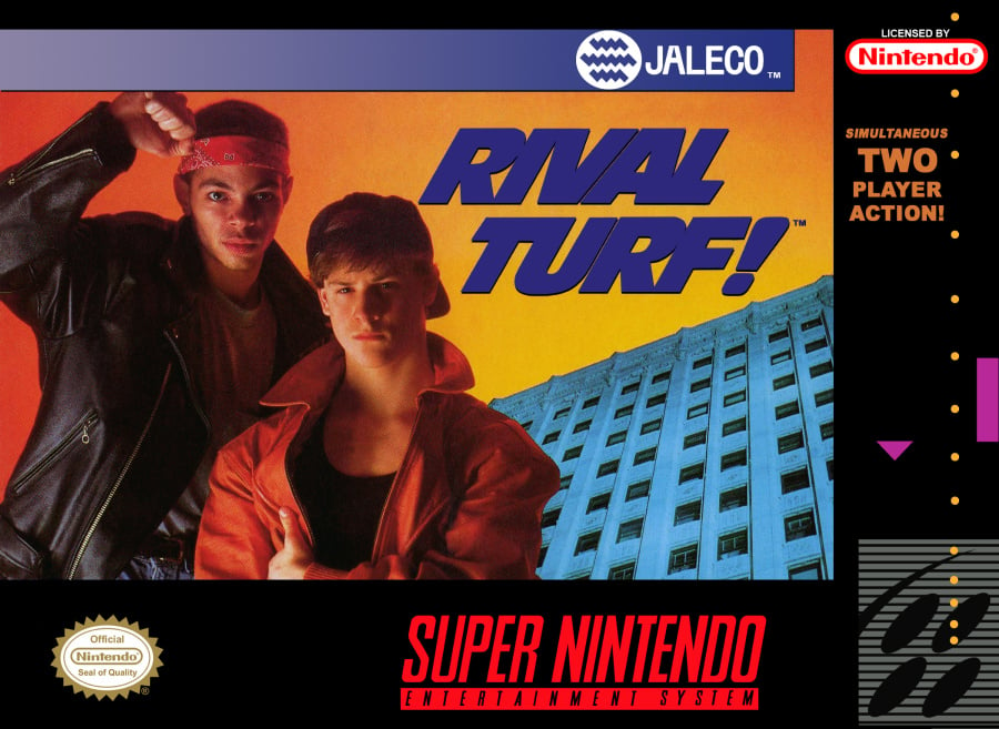
Another one from Jaleco. It appears that the North American cover for Rival Turf! involved getting two cast members from the local school production of West Side Story over for a quick photoshoot at the office before escorting the kids off the premises and snapping a shot of the building on the way back in. Three minutes later: voilà!
Julie Finds a Way (Nintendo DS, 2007)
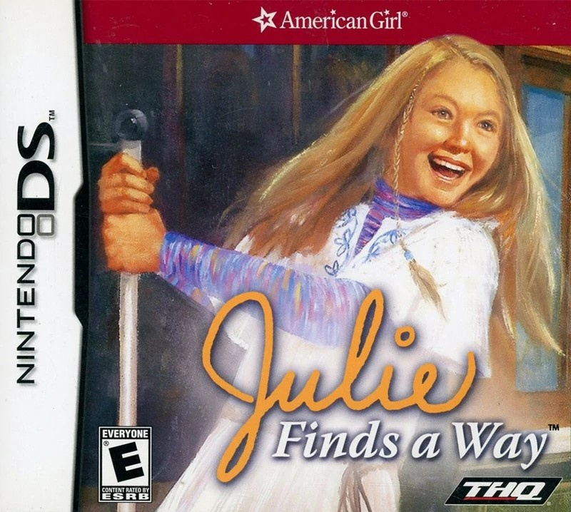
It would be easy to fill this list with games aimed at kids, which would be unfair, but the Wii and DS libraries in particular are filled with real stinkers aimed at that demographic. Julie Finds a Way is part of the American Girl Julie series which includes books and dolls. This kitsch cover is a simple copy-paste job from one of the wholesome books with a logo thrown on top. Julie looks somewhat maniacal, and we must admit we found some enjoyment in imagining that she’s driving the pointy end of the pole she’s grasping into the eye socket of a zombie or other such ghoul. Julie found a way, although we really wish she hadn’t.
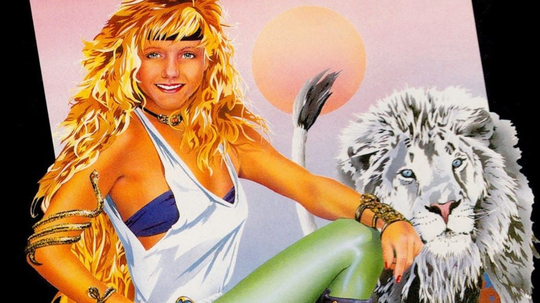
Ghost Lion (NES, 1992)
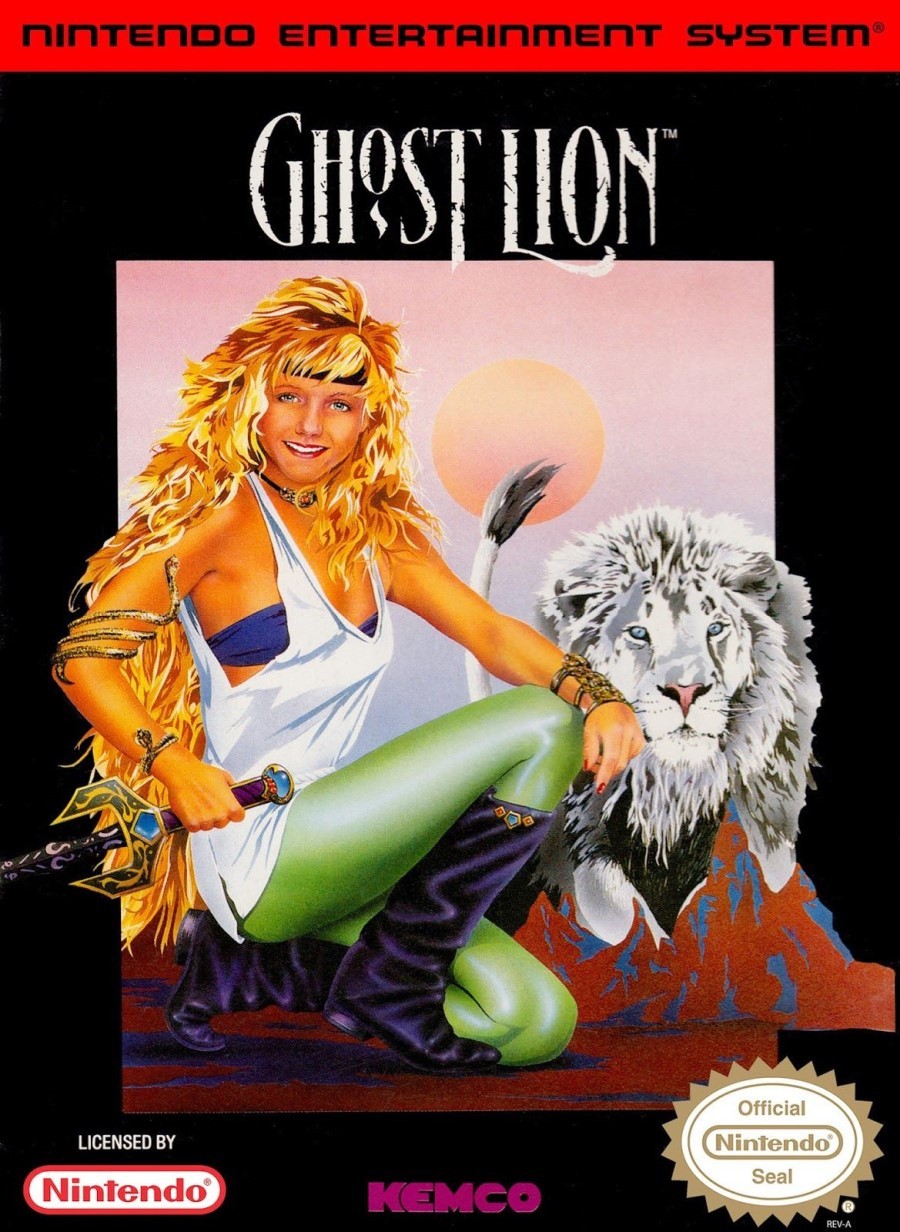
Blimey, it’s hard to know where to start with the North American cover of this forgettable Dragon Quest clone. The logo’s not bad, and the image has some interesting elements, but the face of the blonde-haired lady appears to belong to a 12-year-old boy. In fact, it looks like his mates cut out his photo and pasted it on the box to make fun of his luscious goldi-locks. Some random mountains appear in front of the lion – that is unless he hasn’t been let out for a week and those mounds are of his own making. The huge black border feels unnecessary until you realise that’s the only thing tying it all together.
It’s memorable, we’ll give it that. It reminds us of Phalanx, a game cover which typically finds itself on worst box art lists, but for which we have a surreal fondness. Would we even remember this game if it weren’t for the cover art? Look at it long enough and you may even start to think it has some merit. Would it be okay without the face of a young boy pasted onto the lycra-clad woman’s body? No, it wouldn’t. It would still be riding that razor edge between ‘awful’ and ‘truly dire’.
Virtual Chess 64 (Nintendo 64, 1998)
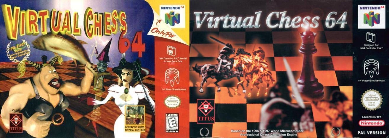
We understand the desire to make video game chess a little more exciting, but the unsightly mix of crude models, fish and questionable boob-window on the North American cover of Virtual Chess 64 (left) looks like some horrific low-poly fever dream. It’s what you get if you tell someone with poor IT skills to make ‘do a Dali’ on the computer. What’s going on with that logo? The European version (right) is hardly scintillating, but you could argue it communicates what players could expect. We imagine chess enthusiasts took one look at the North American box and stuck to their trusty physical board.
Quite a wretched line up, we’re sure you agree. But which do you think is the absolute worst? Click your candidate and hit the vote button:
Unfortunately, there are plenty of other candidates, but that’s more than enough for today. Feel free to let us know your opinions on the entries above, add your own proposals for the lowest of the low in the box below, and be sure to join us at the weekend for the next round of Box Art Brawl.